Responsibilities
Core responsibilities of creating and maintaining a consistent visual language and user experience across multiple digital platform products. This includes contributing to the design system, Implementing UI components such as buttons, forms, cards, navigation menus and fluent navigational patterns. As well as creating and enforcing design guidelines and commonly used patterns. Collaborating closely with cross-functional teams such as product managers, product designers and developers to ensure that the design system is efficient, user centered, and accessible. Each iteration to the design system has been conducted based on user research and testing to validate design decisions and continuously improve the design system.
Design Systems
Let's Break Down the Issues...
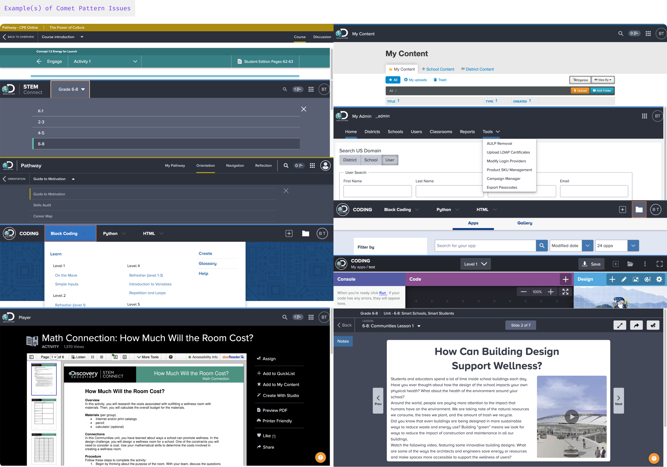
Beginning my journey at Discovery Education the product team(s) were concurrently utilizing a former design system named Comet, while Comet served it’s purpose and usefulness throughout products throughout the years, it had some core issues that needed attention:
- Comet was outdated, and many of its basic functions, components, and principles belonged to a time that lacked support.
- It lacked a unique style that could visually represent the essence of Discovery Education.
- Inefficiencies in UI stylistics and needs for new or missing components that were in need from product teams.
- The UI and UX patterns were repetitive and inconsistent, causing a disjointed user experience on the platform.
- While the platform served as a singular experience for both Teachers and Students, we had theming and composability needs where we could tailor the experiences individually based on grade banding criteria.
The Plan of Attack
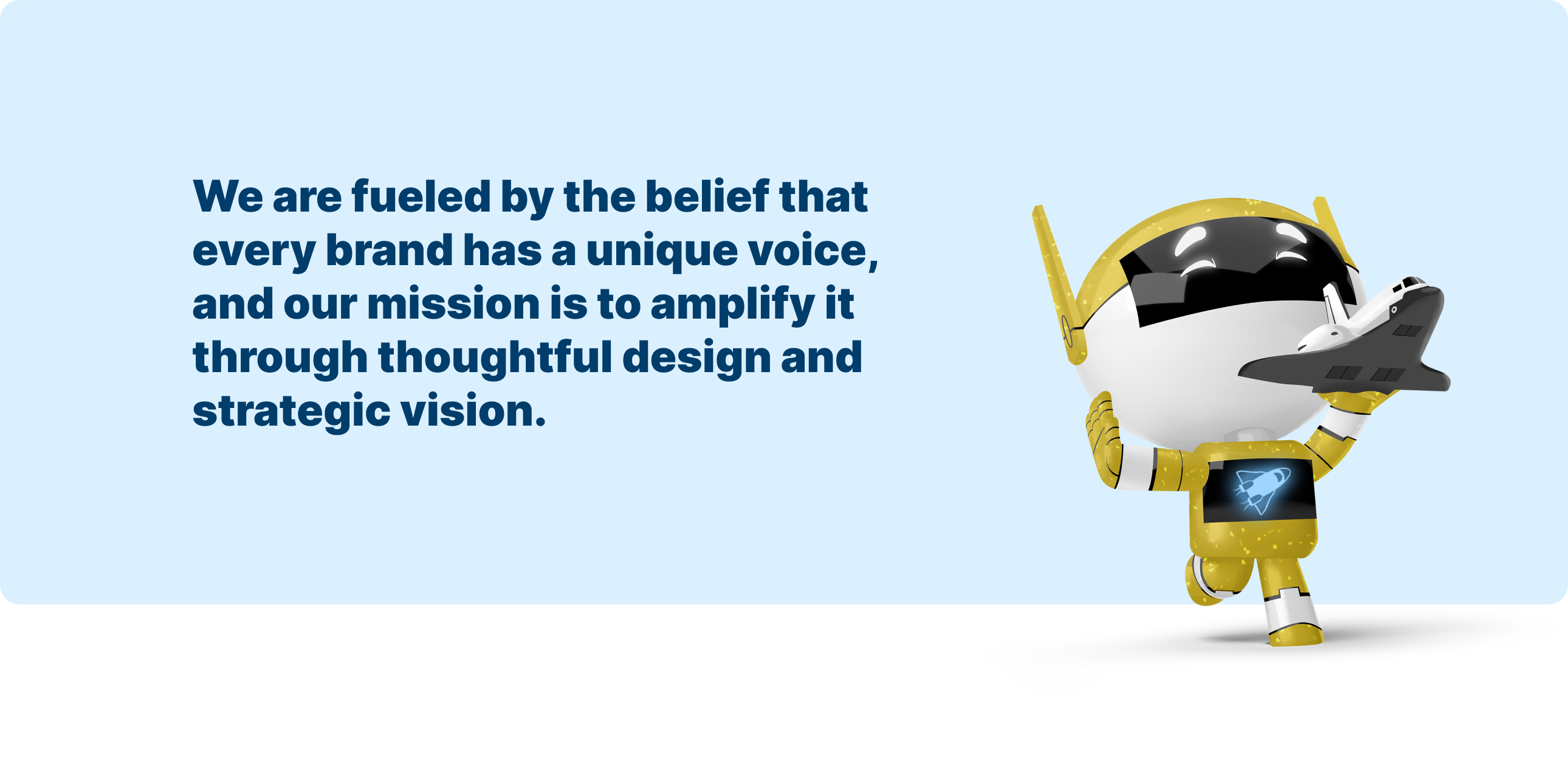
So began the creation and foundations of Nebula!
Definition of a Nebula
A nebula is a distinct luminescent part of interstellar medium, which can consist of ionized, neutral, or molecular hydrogen and also cosmic dust. Nebulae are often star-forming regions, such as in the "Pillars of Creation" in the Eagle Nebula. (an enormous cloud of dust and gas occupying the space between stars and acting as a nursery for new stars)
We utilized all necessary understandings, flaws and learnings from the development stages of Comet when beginning Nebula. Without continued support and investment of a system, it can and will become stale which leads to adoption fall off as new needs arise from product teams. While Comet functioned as it needed being a system, it was missing proper usage and visual guidelines. The “who we are” and how we “feel” as a brand and product.
A design system will innately raise the quality floor of the product teams producing experiences, but without a dedicated exploration and experimentation team it can also squash the quality ceiling resulting in a decent, but not a stellar experience or product.
We needed to hone in on our product identity as a separate artifact, helping us stay focused on who we are, while improving the experiences of products for our end users.
My Role
My core role coming into the Design Systems team was to target and address both product thinking and human centered design with the initiatives of leaderships goals. Executing key business results, understanding both spectrums of our target audience while co-collaborating and tailoring solutions for each product team needs.
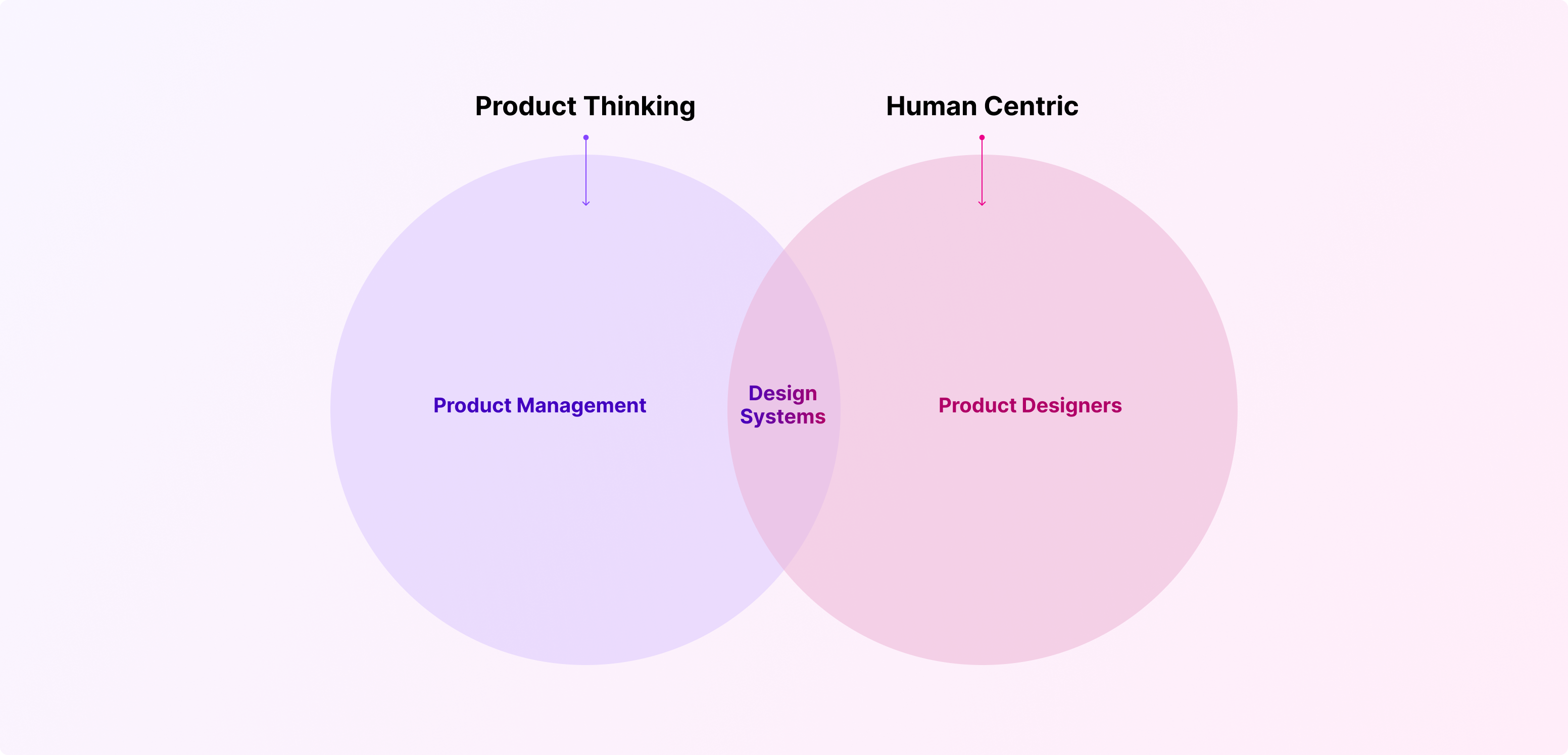
The Foundations
My core role coming into the Design Systems team was to target and address both product thinking and human centered design with the initiatives of leaderships goals. Executing key business results, understanding both spectrums of our target audience while co-collaborating and tailoring solutions for each product team needs.
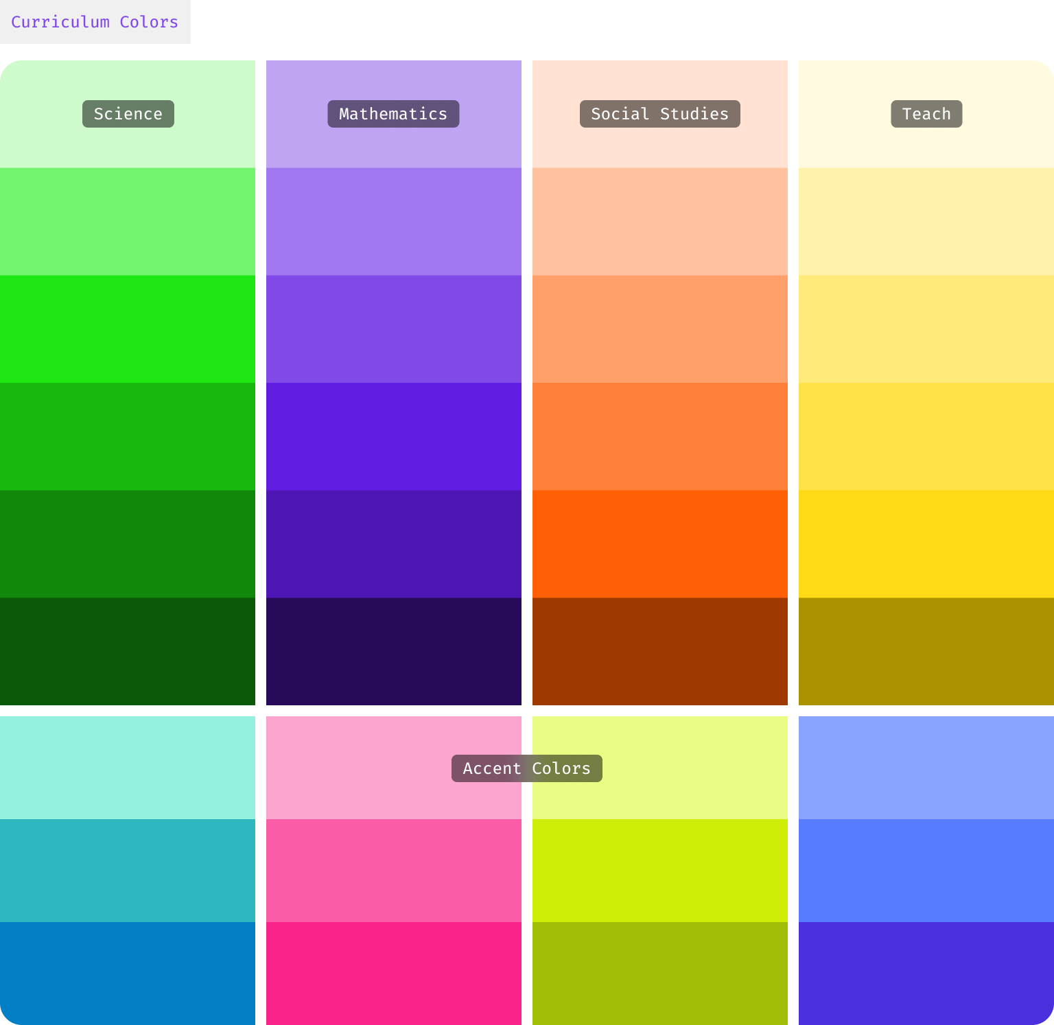
Curriculum
Serving as roadmaps for teachers and students, guiding the learning process by specifying what topics will be covered, how they will be taught, and what learning outcomes are expected. We’ve created supporting color palettes that tie directly to specific curriculum’s, used throughout the online experience and coded into our in class materials.
Typography
Serving as roadmaps for teachers and students, guiding the learning process by specifying what topics will be covered, how they will be taught, and what learning outcomes are expected. We’ve created supporting color palettes that tie directly to specific curriculum’s, used throughout the online experience and coded into our in class materials.

Proxima Vara
Proxima Vara is now our go-to font at Discovery Education, chosen for its accessibility, variety, and impact. While we previously used Proxima Nova as our main system font in the Comet Design System, we've now upgraded to Proxima Vara. This change offers our Product and Print designers more flexibility with weight and slant options.
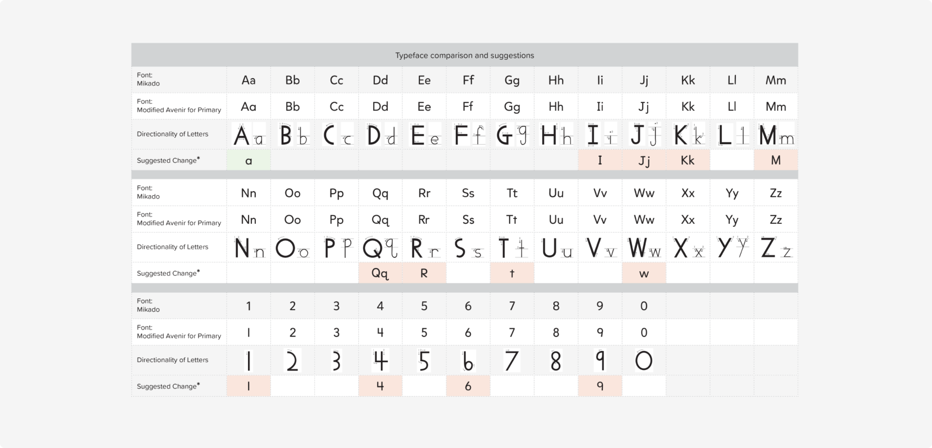
Mikado-Chan
Mikado-Chan is a custom-made typeface designed to align with readability standards in education for both US and UK students. It was originally crafted by Hannes von Döhren in 2013, and we've expanded it by adding additional character sets. We use Mikado-Chan in lessons and resources that teachers can offer to their younger students.
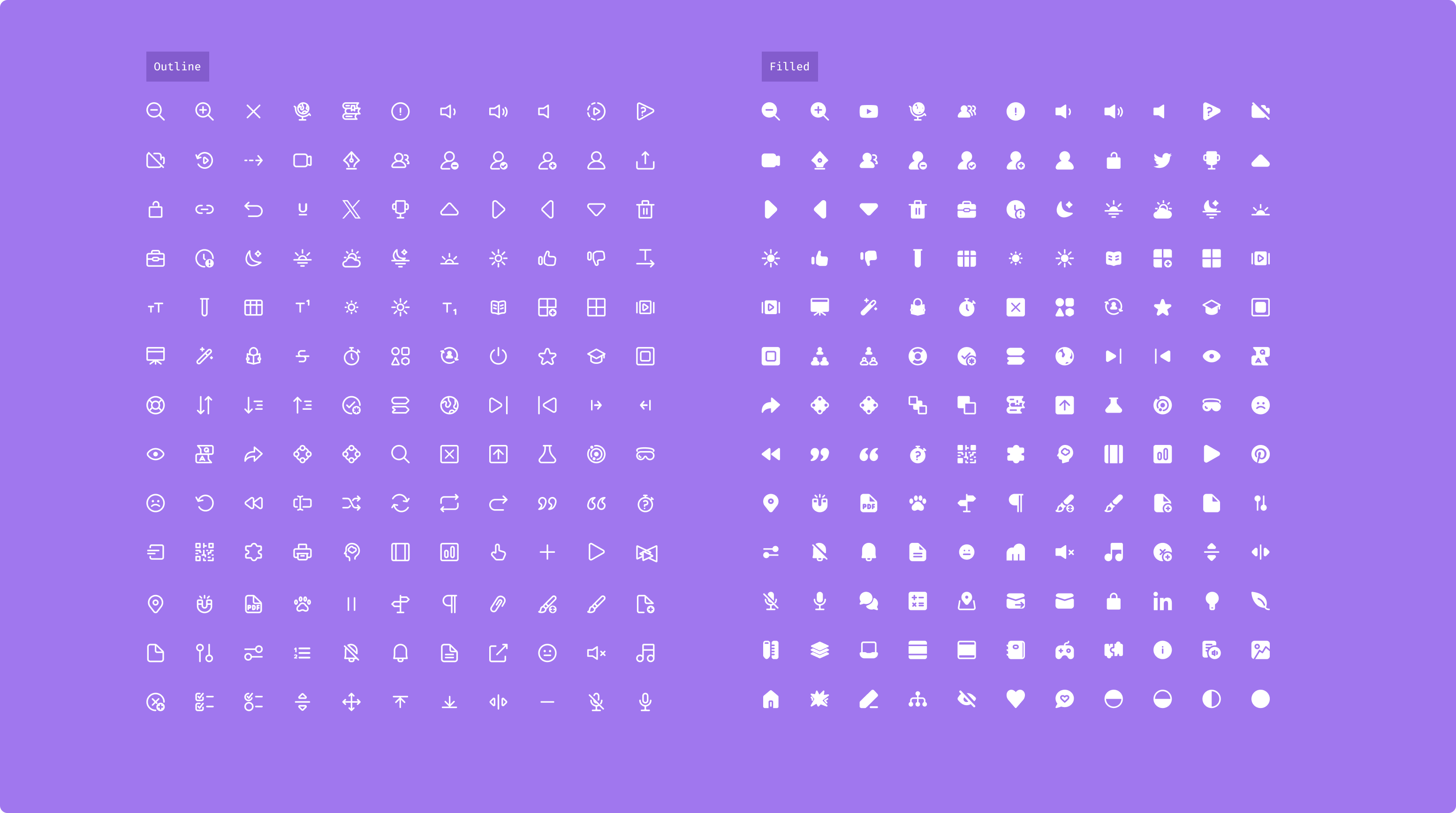
Iconography
We've refreshed our Iconography, doing away with the clutter of redundant or ambiguous icons from our previous collection. Instead of continuing with an increasingly confusing array, we've reset from ground zero. Now, we're introducing icons that hold specific purpose or meaning to enhance usability, like representing different asset types. All updated icons have been crafted in-house by the Design Systems team.

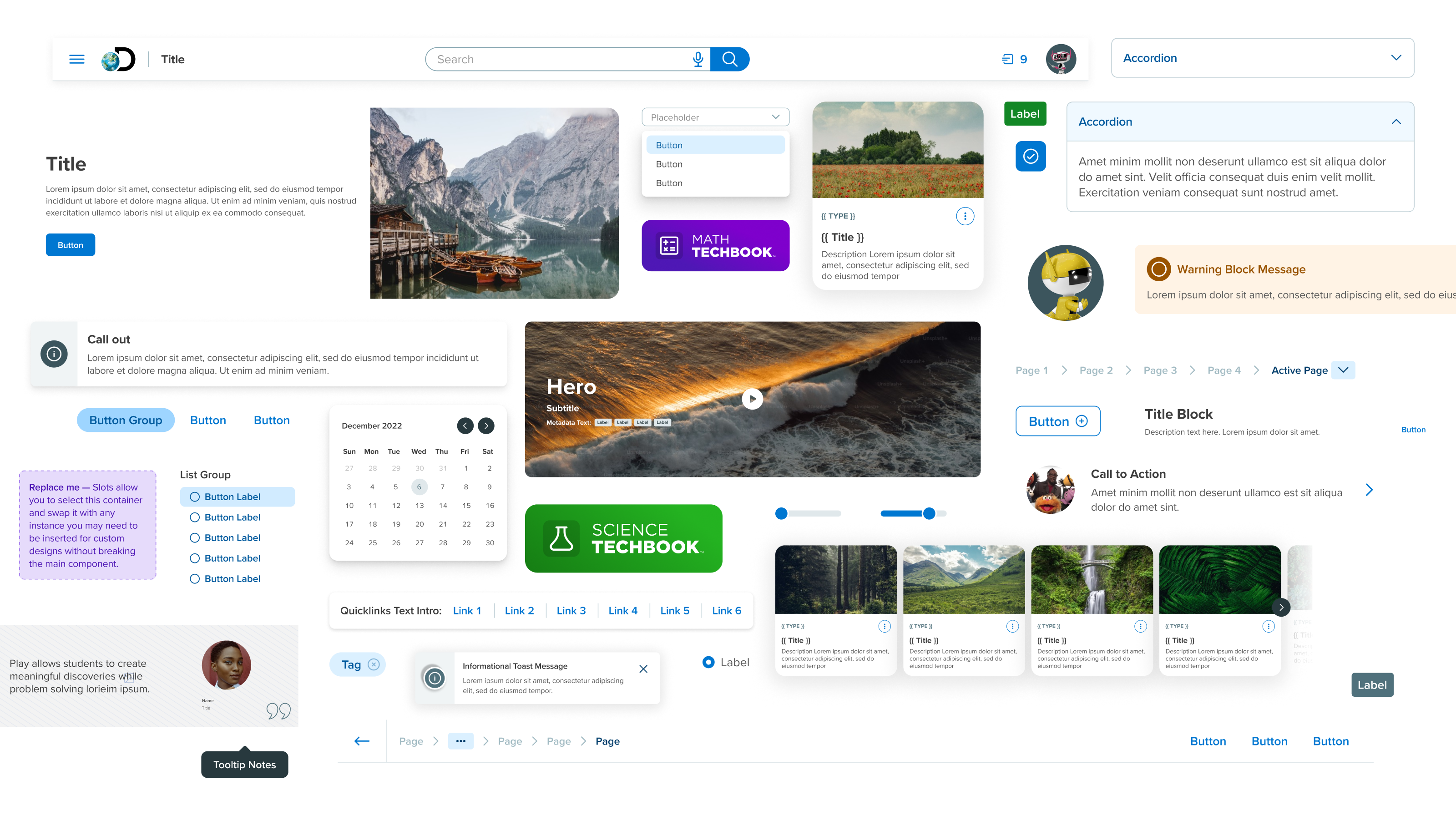
Components
Each component has been carefully considered with usability, accessibility, and scalability in mind. We prioritize our components down to the smallest factors of the interface. Buttons, text fields, each of these atomic level components should be designed to either stand alone or combine to form larger, more complex components. Fostering consistency and efficiency in each interface. It’s essential to consider how each component will adapt to different screen sizes and devices, ensuring a smooth user experience.
Configuration
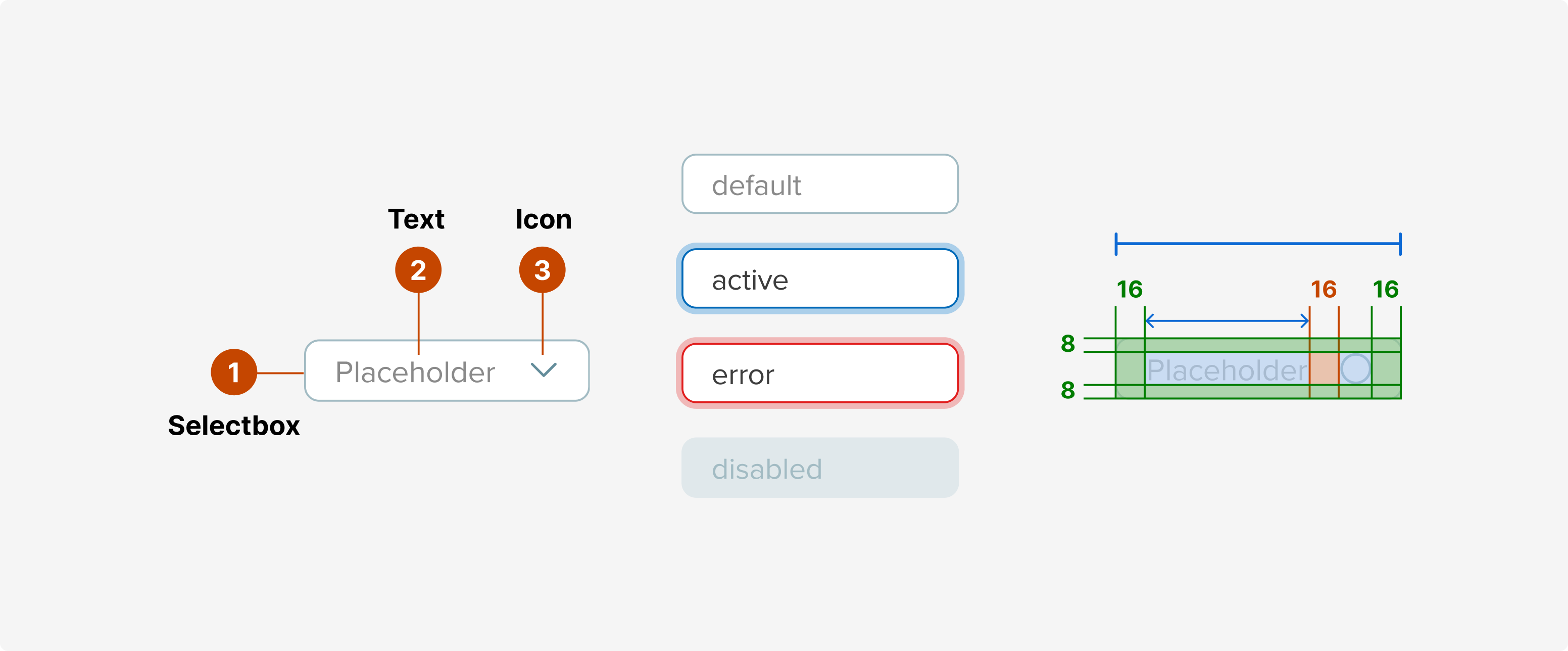
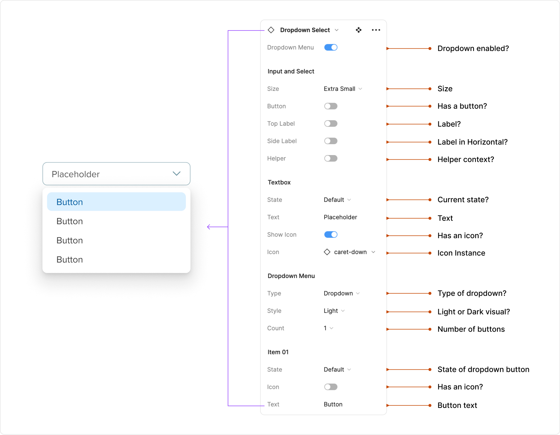
Let's consider a Selectbox and Dropdown combination. By setting up various prop options, each component can be customized in terms of state, size, iconography, buttons, and other usable features. This configurability enhances not only the visual appeal, but also the component's functionality. The pre-configuration of these elements empowers our designers to maintain consistency and uphold common UX patterns across various contexts, ensuring an efficient workflow throughout the platform.
Creation
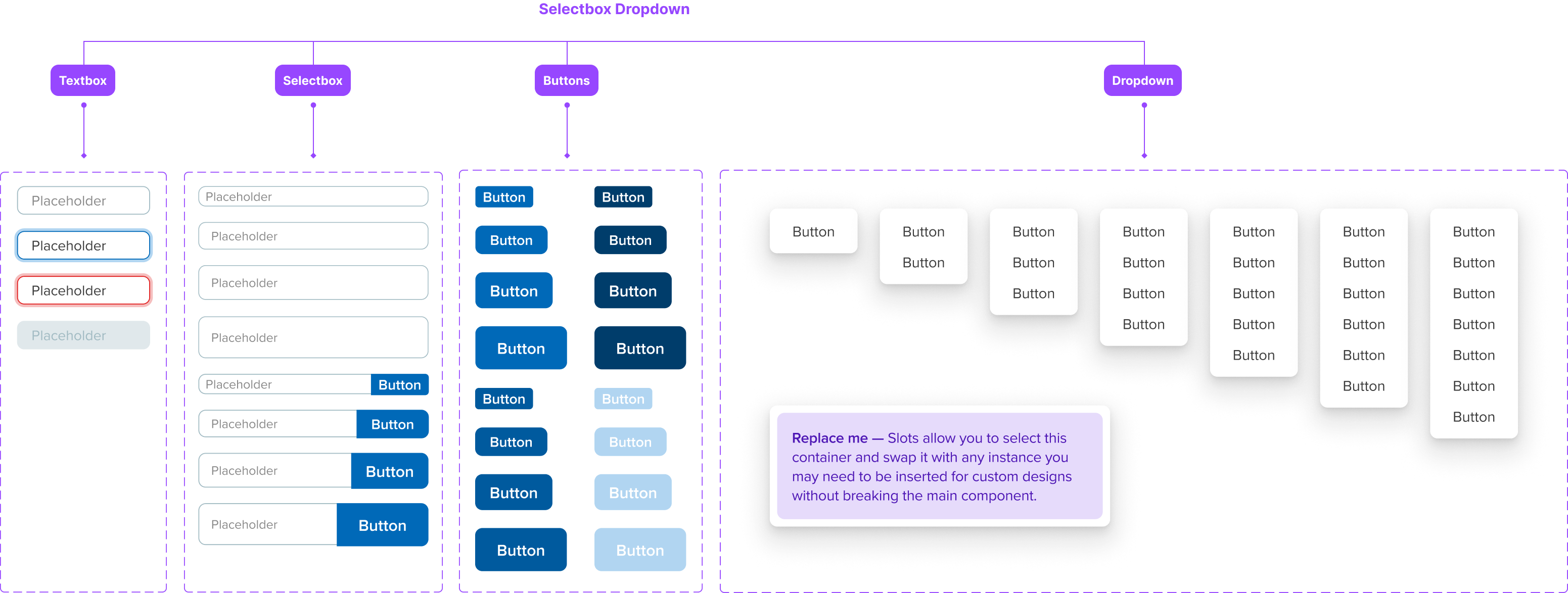
When crafting something as complex as this, we pay attention to every detail. Each part of the combination pattern is considered, reusing components that are already in the system. Take our Selectbox and Dropdown example—we purposely employ the Textbox, Selectbox, Button, and Dropdown components that already exist. This approach not only streamlines the design process, but also boosts the productivity of both our designers and developers.
Acknowldgements
Senior Product Manager: Adam Sedwick, Creative Director: Kandice Levero and many, many more.
All work owned by Discovery Education.
*Work in Progress - this case study will be continously worked on.